
Fever
Working with an existing product, I added a feature to enhance purchases and create an easier user flow.
Overview
Challenge
Adding a feature to an existing product to help increase app usage and user friendly navigation.
Solution
Fever is a mobile application that helps users purchase tickets to events happening in their city. Users can choose what city they want to find events for and browse the hundreds of options. Adding a cart feature to this app would help users purchase tickets to more than one event and save events that were added to their cart. This feature will also help increase purchases and create better user-friendly navigation.
Role: UX/UI Designer
Tools: Figma, Photoshop
Process

Research
Initial Research Goals
Determine how well-known Fever is
Determine how people search for events in their city
Where do people purchase event tickets
How will Fever gain an audience
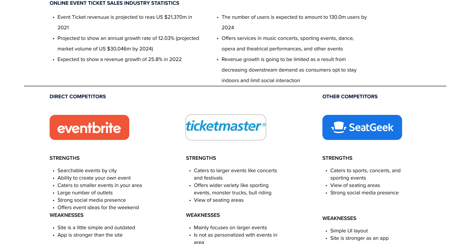
Comparative Analysis
My goal for this project was to not change Fever's brand. I wanted my feature to fit right in with the app as if it was there since the beginning. To do this, I had to do some design research. This analysis was done between popular event ticket services that offer similar experiences. Gathering ticket sales statistics helped me understand how large this industry is and how many people use it.
Demographic Info
There were 3 people who participated in the research interviews and varied in age from 24-27. All participants were familiar with social media sites and have used different sites to purchase entertainment event tickets.
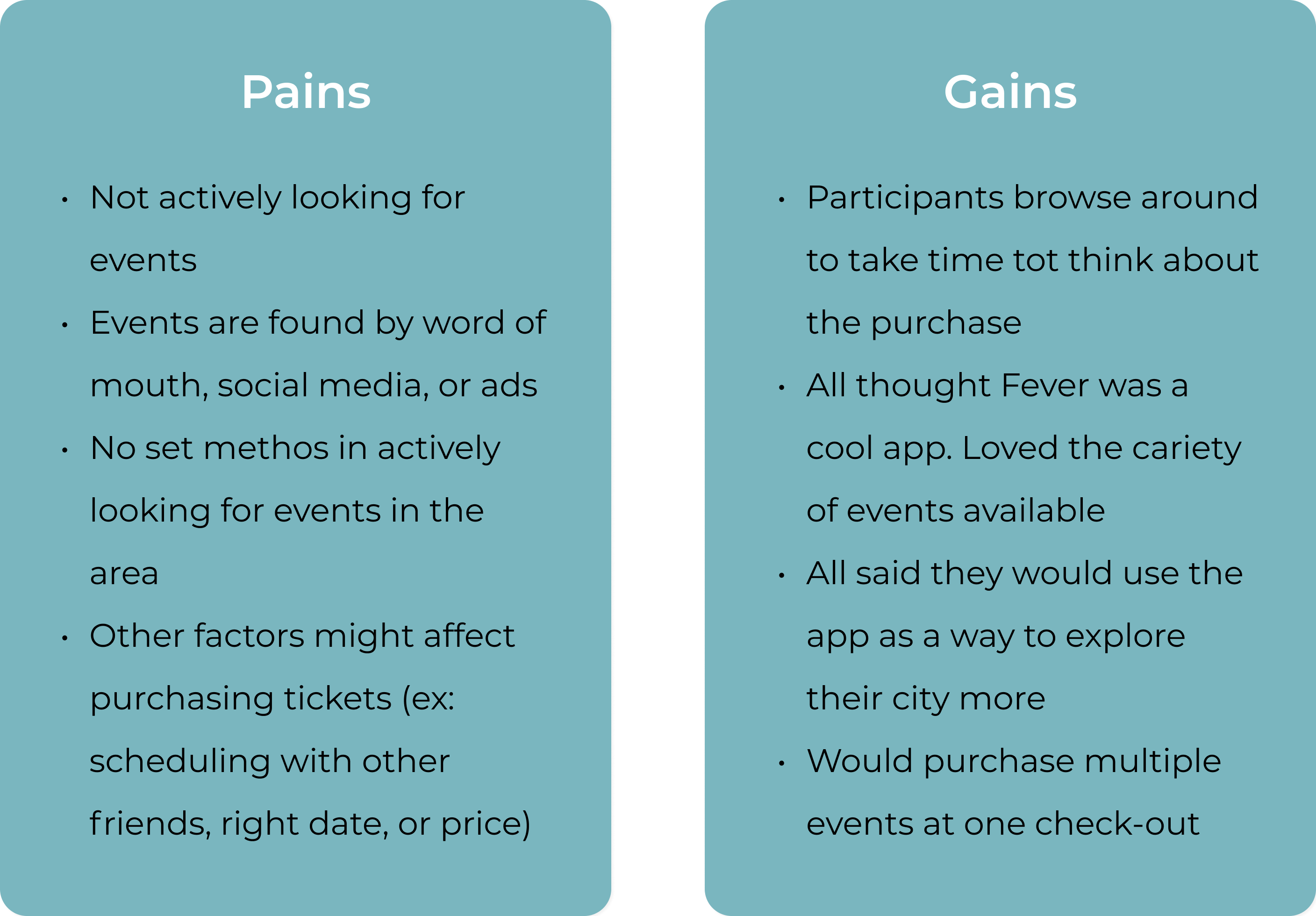
Pains & Gains
Suggested Solution
Using this research to supplement my initial idea for a feature, I developed the following elements to begin the design process:
Items being saved in cart with the time and date (if event is still available)
Purchasing more than one event
Having the option to check-out or shop for more events
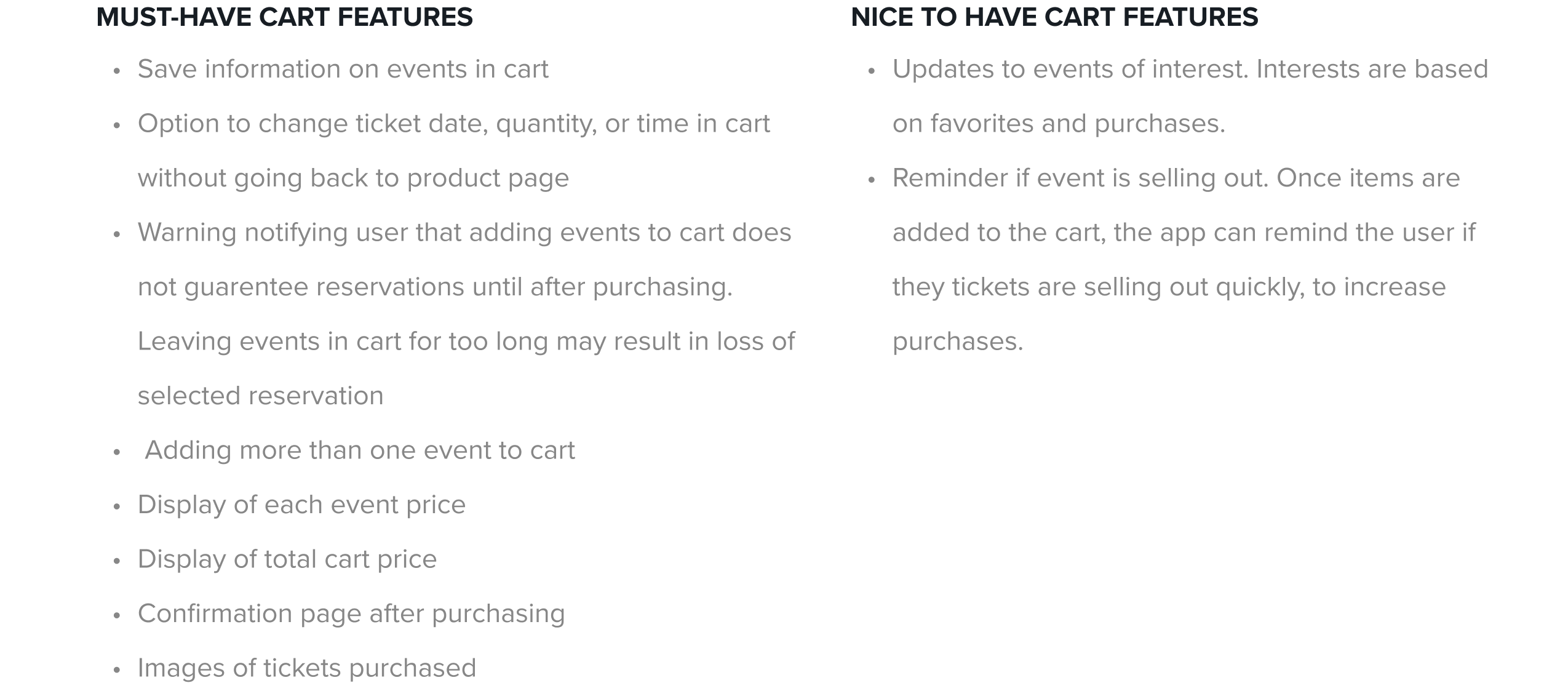
Product Development Roadmap
Fever has many products and features to its app. When adding a cart feature, I created a product development roadmap focused on cart features. Below are the features I added to the cart:
Design
Sketches
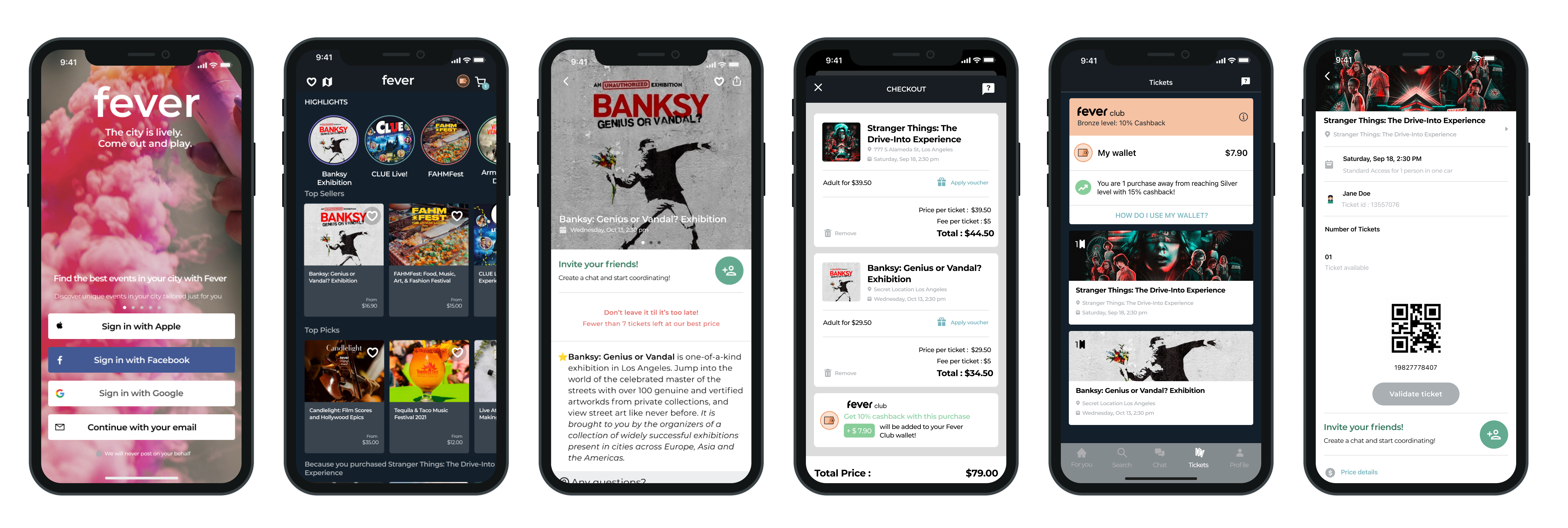
When sketching the pages for the app, I focused on how the cart feature will fit onto the home screen. I also wanted to design a user friendly layout when adding multiple events to the cart. Adding the event prices as well as the total price helps users see all the fees on one page, preventing confusion.
Task Flow
When creating this task flow, the goal was for the user to be able to use the new cart feature to check out without any hassle. It begins with the user logging into the app, browsing events, choosing an event, selecting time, date, and quantity of tickets, and finally completing the purchase in the checkout phase. Below is a visualization of the task flow:

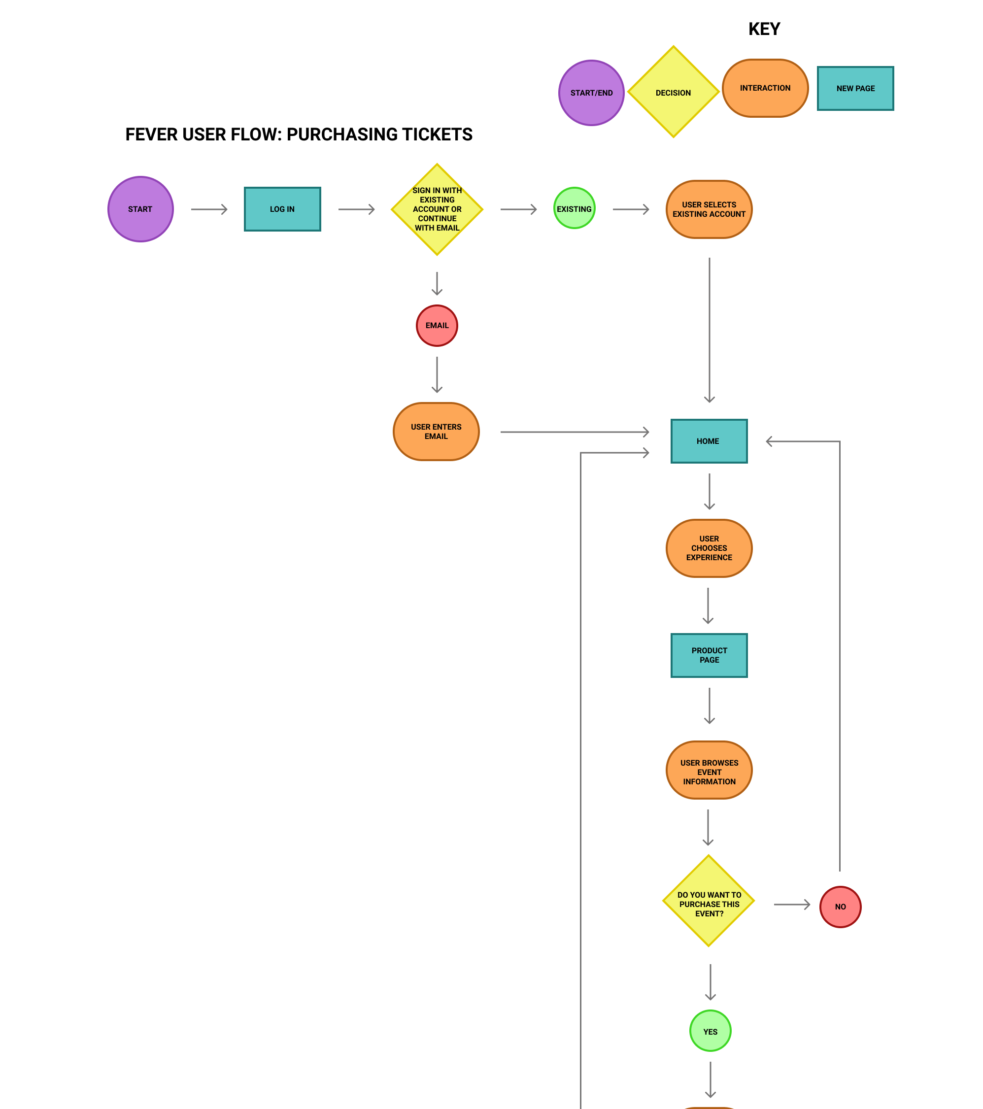
User Flow
The User flow went a little more in depth. The user went through the same process to purchase tickets but was faced with decisions along the way. Users were able to choose their event but had a choice to add another event to the cart. This feature increases purchases and lets users accomplish multiple things in one checkout. Below is a cropped image of the user flow:
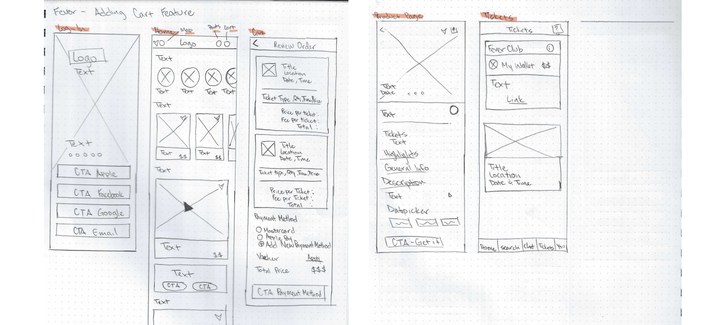
Wireframes
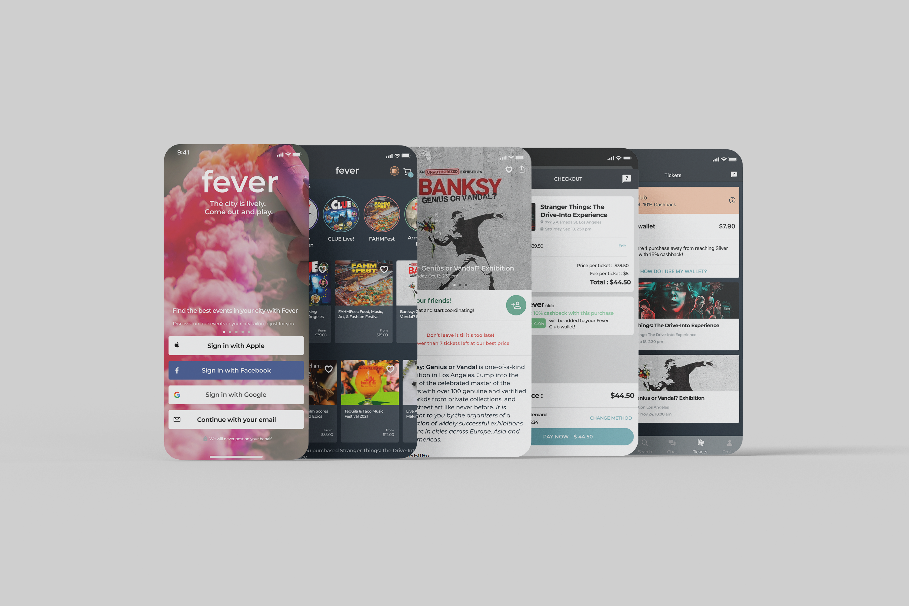
Wanting to preserve the original app layout, I decided to add the cart icon on the homepage. Adding the cart icon to the homepage made it easily accessible for users to view what is in their cart. Working my way down, I began creating the log in page and ended with the final ticket viewing. One the home page, the event icons scroll horizontally to save space.
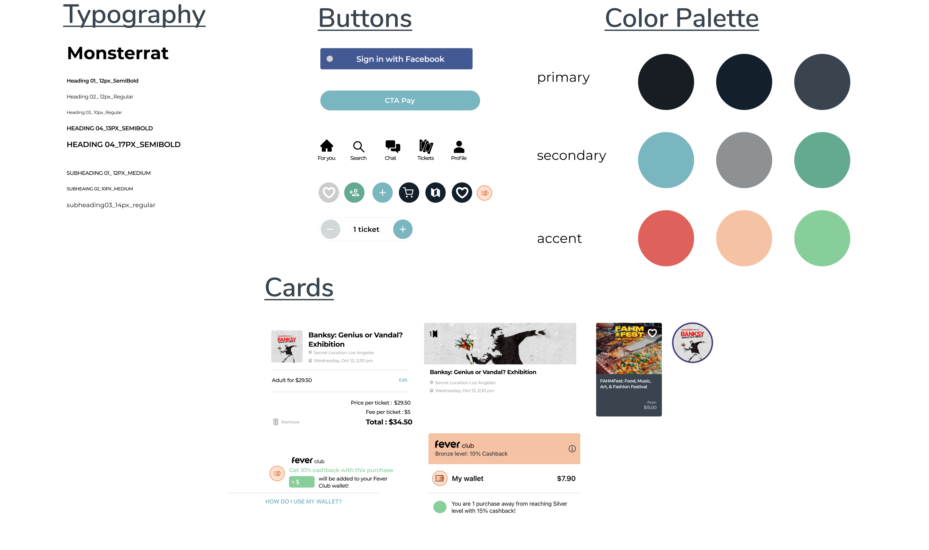
UI Kit
This UI kit contains typography, buttons, a color palette, and cards. Since I was only adding a feature to the app, most of the elements remained the same. I created a UI kit to help with building the pages. Using components of the cards made the process go a lot faster.
Responsive UI Design
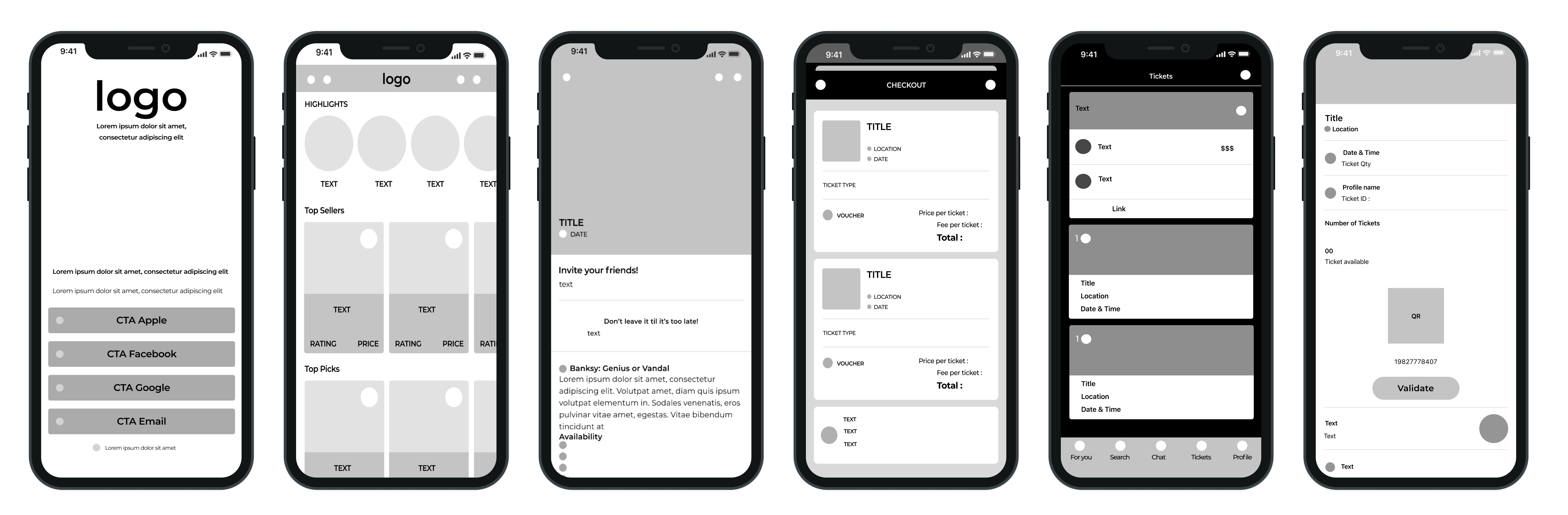
Below is the first version of the design layouts. Adding the cart icon to the corner of the homepage fit better than I anticipated. I added multiple events to the cart to show how the feature would work and look. Tickets can be viewed on the ticket section. When opened, users can see the details of their event.
Test
User Prototype Testing
After creating the prototype I conducted some user prototype testing on the Fever flow created. The flow included logging in, checking the cart, adding multiple events to the cart, successfully checking out, checking purchased tickets in the ticket section and viewing purchased ticket information.
I conducted prototype testing with 3 participants as well as my colleagues. They provided great feedback about the app and had some great suggestions. Some suggestions that made improvements to the prototype included:
Changing hierarchy of product page descriptions
Anchor date picker to bottom of screen
Add separate ticket selector page
Add CTA button to edit ticket information at checkout
Provide a section for discounts and vouchers
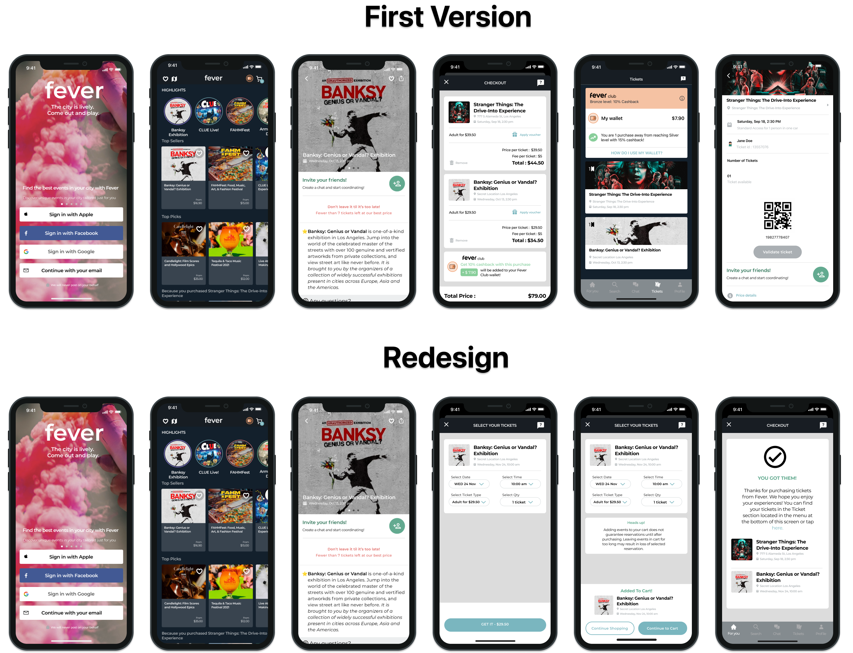
Final Outcome
Final Design
After receiving great feedback from participants, colleagues, and mentor I designed the final pages of the app. The changes include:
Having the purchase button stick to the bottom of the product screen at all times
Providing options to change ticket time, date, or quantity on the cart page
Adding a warning to users that adding the event to the cart does not guarantee reservations until after purchase
Visible CTA for users to view their purchased tickets in the ticket section
Prototype
Click the image below to test out the prototype.

Final Takeaways
Adding a feature to an existing app like Fever is just as tricky as creating an app from scratch. Most participants weren't familiar with experience event apps like Fever. Many don't know where to look for events and decide to google or click ads on social media. Fever offers events in many different price ranges. Adding a cart feature to be able to purchase more than one event in a single time would increase profits as well as increase easy user flow.